

What would you say is the most important thing in a good photograph?
Colors? Idea and expression? Sharpness? Perspective?
Well, since there are no “right and wrong” everyone is right, but in my book one of the most important thing is definitely composition. It’s the same in almost every art form, but since in photography you don’t always have time to plan the situation in details, composition becomes a very important skill in your decision making.
I never learned photography in the “old fashion” way of school or teachers, and my composition skills have developed by my own sense of intuitive point of view. It’s only later that I diagnosed the decision making I made without thinking about it. I want to share with you what I learned, and maybe in a way – help you diagnose your own decisions.
I have no intention of mentioning all the different approaches to composition, you can add to this as much as you want. I only want to make my own beliefs prioritized and organized here.
General statement</u>
There are many things to think about while deciding on a composition (that you have a split of a second to think about). That means that you have to realize all the parameters in a spontaneous way, without breaking it down like I do here. What do I mean?
You have to consider all the lines in the frame, you have to consider the dynamics of movement, the direction, the things outside the frame, the Depth of field you are using…
It’s impossible to forecast everything. What makes a good photographer skillful is deciding on the right composition, without thinking about it. In my opinion, you have to add something to all I mentioned – be original. Don’t go with the composition you feel comfortable with.. explore different options while being aware of what you want to show with the photo – that would be forever yours.

The subject</u>
What's the photo about?
To make it clear is the first thing you have to consider while thinking of the composition. It should be very obvious with a single glance to every viewer what the photograph is "about". That doesn’t mean the subject should be in the middle of the frame, not at all. That means that you should build your whole composition while being aware to what is the subject. You can lead to it with graphic lines, focus, angle, negative space, colors, and lighting.
Tip: The subject maybe something that you can’t even see in the photograph. Think about it.
Leading the viewer</u>
How the viewer's eye is lead from one part of the photograph to another?
One way to give flow to a photograph is to use lines. They can be horizontal, vertical, diagonal, converging or diverging lines. This will create the illusion of motion (or lack of motion if so desired). Diagonal, converging or diverging lines are considered to be "dynamic" while horizontal and vertical lines are considered to be "static". A careful balance of dynamic and static elements will give an overall sense of motion to your photographs. You should also consider the direction of leading the eye. If you place someone watching to the right, on the right side of the photo, you loose the leading of the viewer and create a sense of something missing. You should leave some space for the movement in the frame. Use perspective to draw the eye or use it to give a point of view and create the illusion the viewer is on the scene.
Tip: If you place the subject in the middle of the frame, it’s much harder to lead the eye to him and the photo might become flat.
Perspective and proportions</u>
You want to show something is far, something is huge?
Think of proportions, of scale. The viewer must be feeling what you feel while you are “out there”. If you shoot a wonderful sunset and you want to show how huge the sky looks, you have to include something in the frame to give scale. Without it the feeling can’t be transformed. If you can show something repetitive in the frame you will get good dynamics to the frame, but you will also get a sense of perspective. Using this is one of the things I really love to do.
Tip: If you have the ability to control light and composition – you are a master in technique. Think of using light in your composition to get a silhouette or a nice lighting that shows the difference between your foreground and background and help the feeling of depth or scale.


Rule of 3rds </u>
I've been told there's something psychologically appealing about groups of 3's.
I used this rule in my work, without even knowing.. I just knew I shouldn’t center my work. The eye goes to the center as default. If you satisfy the viewer right at the beginning, you lost the chance to lead him inside a good photograph.
In the rule of Thirds we play around that center, placing objects a point about two-thirds up a page. Crop your photo so that the main subjects are located around one of the intersection points rather than in the center of the image. Divide your frame to 9 even squares and imagine the points where the lines meet.
For example in landscapes you can apply the rule of thirds when you place your horizon line one-third up from the bottom, leaving the sky to take up the top two-thirds of the picture.
Tip: Don’t use a tilted horizon line… That can always make a good photo look amateur. Align the horizon line with something straight in the frame.

Negative Space </u>
Basically a large areas of empty space in the frame. Psychologically, we humans want to fill that space with our imagination (kind of like a cartoon thought balloon). Use it in a minimalist frame, or to give the frame a more “dreamy” touch.
Tip: A busy frame with lots of details on one side, and negative space on the other is not good. It will break the order and destroy the feeling of balance. Use negative space in minimal compositions.
Framing </u>
If you can find a way to naturally frame your shot, do it. That adds a wonderful sense of order to it. Look for things such as doorways, bridges, signs and other things to frame your subject under. It gives a sense of perspective and intimacy to the image.
Tip: A door, the way you close in on a face, branches of trees, buildings on the side of the road…
Balance </u>
Sometimes keeping the balance is the greatest thing in a photograph, and sometimes, it’s exactly the opposite. Be aware and think about the meaning of balance in your frame. It could help create a sense of illusion (when it’s not balanced), or just make it classy (when there is a good balance).
Tip: Use the rule of the thirds to put a lot of weight on one side, but always look for someone to balance it of the opposite third of the frame.
Cutting the details </u>
Sometimes you cut important details in the frame not on purpose.. That’s very bad. The viewer always knows when it was on purpose. Think of what you cut and how. Sometimes you have to cut and crop things (sometimes you want to), just think of the best way to do it.
Tip: I love using intentionally cropping of details in portraits… It makes a face look much more interesting, and allows to zoom in to the details.


Now, I invite you to take a look with me, at 10 of my favorites Under my weekly spotlight

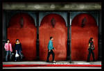
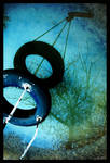
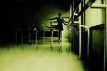
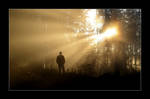
Talking about composition, this is a perfect example of a good and creative use.
The way it's cropped, balanced, leading.. you can see it here clearly.
Total views up to now: 60
Total Favorites up to now: 10

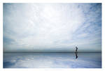
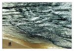
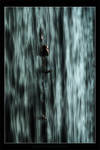
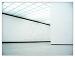
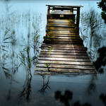
Such a beautiful landscape, and again a perfect example of vertical composition. Very well balanced with a great use of negative space.
Total views up to now: 173
Total Favorites up to now: 31

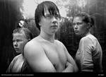
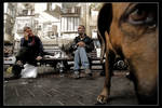
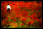
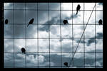
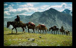
I love the pose, the expressions.
It's a wonderful example of a create group portrait.
Total views up to now: 49
Total Favorites up to now: 4

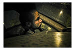
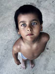
You can see the role the crop, negative space, and the awareness to the subject, had on this wonderful and powerful frame. This is composition. Can you see the rule of the thirds?
Total views up to now: 328
Total Favorites up to now: 55

:thumb60418953: :thumb60421117:
The two frame match to the last detail. One, day time and the second at night. It's nice to see and spot the difference and it works very well as a series.
Total views up to now: 82
Total Favorites up to now: 8

I just love this one.
It's breaking the rules I just mentioned, and some more, and that's a good example of how "there are no rules". It's grainy, messy, full od negative space that imbalance the frame... and it's absolutely wonderful.
Total views up to now: 59
Total Favorites up to now: 7


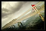
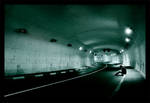
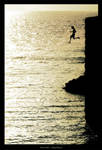
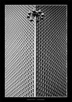
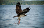
Very creative
The use of composition to lead the eye back and forth is what makes this one work. The depth of field and idea is the backbone, but the composition makes it work.
Total views up to now: 130
Total Favorites up to now: 32


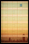
Beautifully balanced frame. I would have left less earth and more sky (since it was so beautiful) to make the rule of the thirds apply, but there is no question it works like that as well. This is an example of balance in a composition.
Total views up to now: 29
Total Favorites up to now: 9

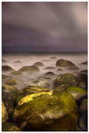
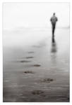
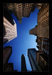
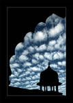
Beautiful long exposure shot.
The sky balances the rocks and leaves space to enjoy the difference. Very moody.
Total views up to now: 37
Total Favorites up to now: 8


I mentioned that you shouldn't tilt the horizon line? Well, here is a beautiful example of how there is an flaw to every rule. The balance work wonderful by balancing the subject to the horizon. Interesting use of composition.
Total views up to now: 140
Total Favorites up to now:16


 :thumb60738114:
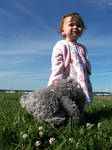
It's amazing to see how much beauty and quality is passed un-noticed here in all one week. I hope that more great work will get noticed here. It's up to us. Use the comments favorites power to support the un-noticed.
Keep supporting!
*****

1. Art is all about expression
2. About Photography, and Israel too
3. DA Thoughts
4. Infra Red
5. Let me shed some Light
6. All the Info you can probably get on me – The BTL with G
7. Listen to "One Day"
8. About freedom of speech and ethics
9. A Different Look At Israel / Part 3, and part 4
10. Where you can download the "A Different Look At Israel" presentations.
11. Summing up 3 years of being a DeviantArt member
12. Summing up what I had to say in 2006
13. Special Interview - An Eye On The World
14. Tips on Shooting indoors
15. Tips on recommended filters
16. Using build in flash
17. Keep your pixels yours
18. About making money in photography
19. Do you know how to get exposure?
20. When does photography become manipulation?
21. About making money in photography
22. A Light unto the Nations
23. Shooting RAW or JPEG?
24. Getting inspired for photography
25. Dust on your sensor?
26. How important is Expression in Art?
27. Questions of popularity
If you didn't hear about the wonderful project of ArtistsForCharity now its the time! go, share, and help.
These are five prints of my work, I gave to the project so far:
:thumb32432455: and :thumb30663927: and :thumb25868807: and :thumb25653391: and :thumb26333866:
Yours, G
If you don't want to read all this Bla Bla Bla, you can simply download the "A Different Look At Israel" presentations here.